Project 3: Designing Web App Screens
Apply your knowledge to build something amazing!
💻 Build an Amazing Website!
🚀 Project Launch!
Get ready to build something spectacular! You're about to create a fully responsive website that looks and works perfectly on phones, tablets, and computers. This is your chance to become a web design superhero!
📊 Project Scope & Timeline
- Estimated Time: 15-18 hours across 5-6 sessions
- Difficulty Level: ⭐⭐⭐⭐⭐ 5/5 stars
- Team Size: Individual or groups of 3-4
- Deliverables: Responsive web prototype, accessibility documentation, multi-device testing report
🎓 Skills You'll Develop
- Responsive web design principles
- Multi-device interface optimization
- Web accessibility standards implementation
- Advanced Figma prototyping techniques
- Cross-platform user experience design
🎯 Your Creative Mission
Objective: Create an interactive web app prototype based on your responsive website design from Lesson 15
What You'll Learn:
- How to transform website planning into functional web prototypes
- Responsive design implementation across devices
- Figma web prototyping tools and techniques
- User flow implementation for web applications
What You'll Create: A functional, responsive web app prototype that brings your website concept to life
🏆 Success Milestones
Your web design adventure includes these amazing achievements:
- 🏠 Homepage Hero: Create a stunning landing page that wows visitors
- 📱 Responsive Master: Make your site look perfect on every device
- 🦭 Navigation Ninja: Build menus and links that guide users perfectly
- 🌍 Accessibility Champion: Ensure everyone can use your website
- ✨ Interaction Wizard: Add hover effects and micro-animations that delight users
🛠️ Your Assignment: Create Your Web App Prototype
🌐 Build Your Interactive Web Prototype
You will be creating an interactive prototype for the web app you planned in Lesson 15. This prototype should bring your app concept, sitemap, responsive layout planning, and accessibility considerations to life through functional screens and user interactions.
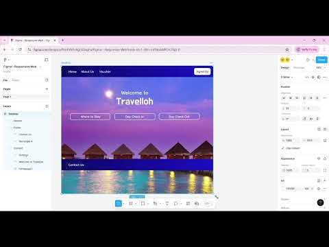
🎬 Learning Resource
Follow this video example to learn how to prototype:
Important: Make sure you develop your own app prototype based on the app you created in Lesson 15.
📋 Prototype Requirements
Your web app prototype should include:
One. Core Pages
- Homepage/landing page
- Main navigation structure from your sitemap
- At least 4-5 key pages based on your Lesson 15 plan
- Contact or about page
2. Responsive Design
- Desktop version (1200px+)
- Tablet version (768px-1199px)
- Mobile version (below 768px)
- Smooth transitions between breakpoints
3. Interactive Elements
- Clickable navigation and buttons
- Form inputs and interactions
- Hover effects and micro-interactions
- Touch-friendly interface for mobile
4. Accessibility Features
- Text alternatives for images
- Keyboard navigation support
- Proper color contrast ratios
- Clear visual hierarchy
5. Website Implementation
- Apply your website concept from Lesson 15
- Implement your planned sitemap structure
- Use your responsive layout plans
- Follow your accessibility considerations
💡 Pro Designer Secrets!
Here's what professional web designers know about creating killer websites:
- Think mobile-first: Design for phones first, then scale up to tablets and desktops
- Navigation is everything: If users can't find what they need in 3 clicks, you've lost them
- Speed matters: Keep your designs clean and optimized - nobody waits for slow websites
- Test on real devices: Your site might look different on actual phones and tablets
- Make it accessible: Use good color contrast and clear fonts so everyone can enjoy your site
- Less is more: White space is your friend - don't cram everything together
📸 Portfolio Checkpoint
Document your process:
- Screenshot your responsive designs across desktop, tablet, and mobile
- Write 2-3 sentences about your responsive design approach and accessibility considerations
- Note any challenges you overcame in multi-device optimization
- Save your prototype links and responsive design documentation
👥 Peer Review Session
Giving Feedback (30 minutes)
- Find a review partner
- Present your web prototype and demonstrate responsive behavior (7 minutes)
- Listen to their feedback without defending your design choices
- Take notes on navigation, accessibility, and responsive design suggestions
- Ask clarifying questions about web usability and cross-device experience
Receiving Feedback Framework
Use "I like, I wish, I wonder":
- I like: What works well in the responsive design and navigation
- I wish: What accessibility features or responsive behaviors could be enhanced
- I wonder: Questions about user flow and cross-device consistency
Implementing Feedback
- Choose 2-3 suggestions to implement in your web prototype
- Document what you changed and why
- Thank your reviewer!
🚀 Career Spotlight
This project mirrors real work at companies like:
- Web Development: Companies like Netflix, Shopify, and LinkedIn build responsive web experiences for global audiences
- Design Systems Teams: Adobe, Salesforce, and Microsoft create scalable web design frameworks
- Entry-Level Role: Web Designer or Frontend UX Designer
- Salary Range: $55,000-75,000 for entry-level web design positions
💡 Industry Insights
"Responsive design isn't just about making things fit on different screens - it's about creating experiences that feel native to each device while maintaining brand consistency."
- Jessica Rodriguez, Senior Web Designer at Airbnb
✅ Before Submission Checklist
Make sure to complete all tasks and double-check your project before submission:
- Keep building on your web app prototypes, refining interactions, and improving the overall design
- Focus on incorporating feedback, ensuring usability, and maintaining responsiveness
- Test all navigation paths and responsive breakpoints
- Verify accessibility features are working
- Review that your prototype matches your Lesson 15 planning
📥 Getting Started
Reference Your Previous Work:
Use your Lesson 15: Responsive Website Design Planning work as the foundation for this prototype. Your app concept, sitemap, responsive layout plans, and accessibility considerations should guide your prototype development.
Tool:
You will be using Figma to create your interactive web app prototype.
📤 Submission
Once you've completed your interactive web app prototype:
Submit your prototype link on the dashboard for review and feedback.
Submit Your Work Here: Submission Form
🎉 Celebration Zone
Fantastic job, web design champion! You've just created a fully responsive website prototype that adapts beautifully to any screen size. That's exactly what professional web developers do!
What You've Accomplished:
- ✅ Built a complete website that works on all devices
- ✅ Mastered responsive design principles
- ✅ Created accessible, user-friendly navigation
- ✅ Implemented professional web design techniques
- ✅ Learned skills used by top web development companies
You're Now Ready To:
- Build websites for local businesses or nonprofits
- Apply for web design internships
- Create your own personal portfolio website
- Help friends and family with their website needs
Show It Off: Share your prototype with everyone! Web design is one of the most in-demand skills in the world right now.
📋 Project Assessment Rubric
Design Quality (40%)
- Visual appeal and web interface polish
- Responsive design consistency across devices
- Navigation and user experience flow
- Accessibility standard implementation
Technical Skills (30%)
- Advanced Figma prototyping proficiency
- Responsive breakpoint management
- Interactive web element functionality
- Cross-device testing thoroughness
Process & Documentation (20%)
- Design thinking and responsive approach evidence
- Portfolio documentation completeness
- Peer feedback implementation quality
- Accessibility consideration depth
Presentation (10%)
- Clear responsive design demonstration
- Multi-device prototype walkthrough
- Web design decision explanation
- Professional presentation delivery